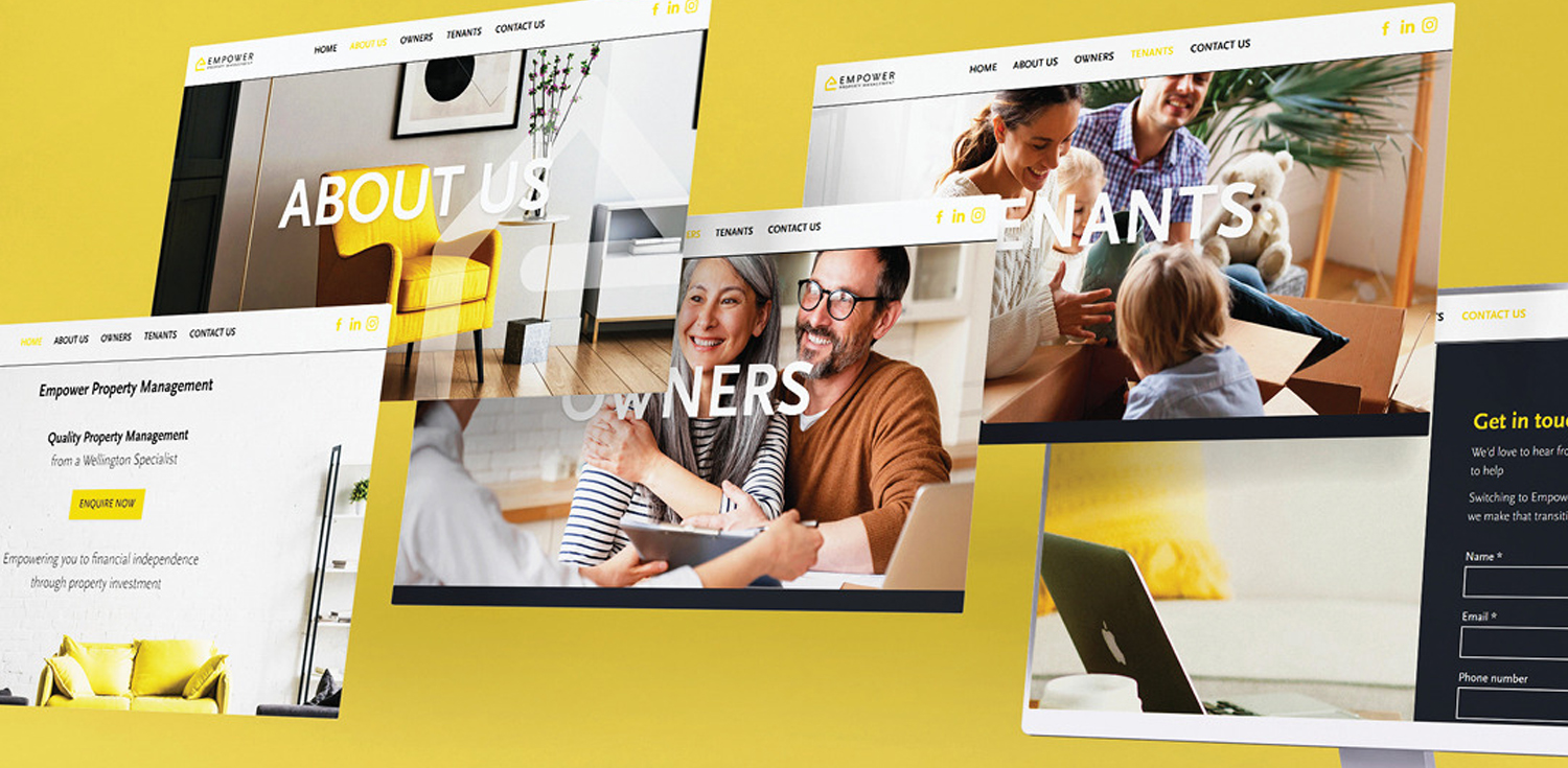
TBD a colourful and impactful brand and website for Empower Property Management.
We created the brand visuals with clean typography, bright and impactful colours and an effective but simple logomark of the letter ‘e’ in the basic shape of a home. The website exemplifies these values with strong use of colour, and typography. The images are the focal point of the website, balanced by the negative space. The result is a great look and intuitive user experience. The team were thrilled to complete another project with a happy client!


