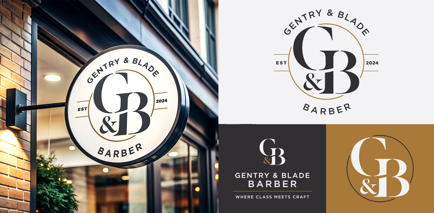
TBD had the pleasure of creating the branding for a new barbers opening on Customhouse Quay.
The Gentry & Blade logo needed to appeal to Wellingtonian workers who commute in due to the proximity to the train station, as well as people living in the CBD.
We designed the logo suite to focus on traditional and retro influence to embody the feeling that the wording “Gentry & Blade” evokes.
The final logo design is elegant, classic and light. The typeface uses negative space to provide visual interest and contemporary feel, and the strong serifs provide a classical look to each form.
Overall, this branding was a fun exercise in the power of typography. We hope to see more of the brand in the future! Check out the branding in situ, or on their Instagram here.
For more examples of logo designs, check out our work page!


