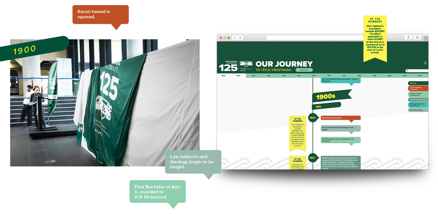
TBD created the Victoria University of Wellington 125 years celebratory installation and web page.
The content consists of a timeline of all 125 years and historical information and images. This was a truly large amount of content, and the most challenging part of this project for TBD was to display it in a way for the audience to navigate easily. The information had to be clean, readable, and as uncluttered as possible. This was done through a repetitive structure, but mostly through the use of colour. Shades of the Victoria University of Wellington branding colours as well as a warm contrasting terracotta colour helped to distinguish the 5 categories of information from one another. This made the flow of information more readable and gave a key for the audience to follow. The bright colours and use of shape and pattern as well as the use of historical images gave a visual interest to what would otherwise be an overwhelmingly large block of text. The shapes that outline the text help to give an accurate point on the timeline and also create white space within the composition that allows the design to breathe. The pattern used is a repeated motif that links to Victoria University of Wellington’s bicultural heritage and is part of its visual identity. The style of the installation differs from Victoria University’s typical branding by making it a less serious, more fun style in order to garner attention from the audience within the installation site.


