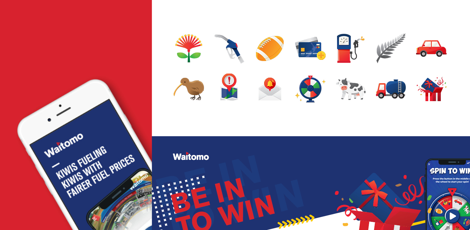
Icon design for new app
In 2020, Waitomo launched a market-leading, fuel purchasing app into the market. We were asked to provide designs for the icons included in the app, and supporting collateral and digital assets. Waitomo has a very strong Kiwi brand, and is an innovator and disruptor in the fuel market – they like to do things differently from the rest! To reflect their accessible, fun, and Kiwi approach, we chose bright primary colours to compliment Waitomo’s brand colours, with geometric shapes and recognisable features (such as the ‘thumbs up’ smiley face). These icons conveyed the Waitomo brand well but also worked very well with the animation as we brought these brand features to life.
As a good old kiwi company
Waitomo hired TBD Digital to produce two videos - one to advertise their new app to customers, and one to take customers through the process of purchasing fuel at their unmanned Fuel Stops. There was a lot of information to be included in each, and the challenge was to be able to impart a high level of detail to the customer in a way that was memorable rather than overwhelming.
We chose a light-hearted, animated approach to advertise the app, resulting in a colourful and appealing style that conveyed all the necessary information with clarity and flair. For the fuel purchase video, we chose an approach that took prospective customers through the whole process in real-time, outlining each step clearly, and keeping the audio to an absolute minimum so that people could focus on the visual cues. Essentially, this is a teaching tool, so we kept it simple, detailed, and familiar.


